Fluttersome FPP and Fabric Choices
We know that value and contrast matter when choosing fabrics for a quilt pattern. But when you’re making the FPP alternative layout of the Fluttersome quilt block, the order of the FPP fabric can also impact the design. Let’s take a look at a couple different color layouts and see how the design changes.
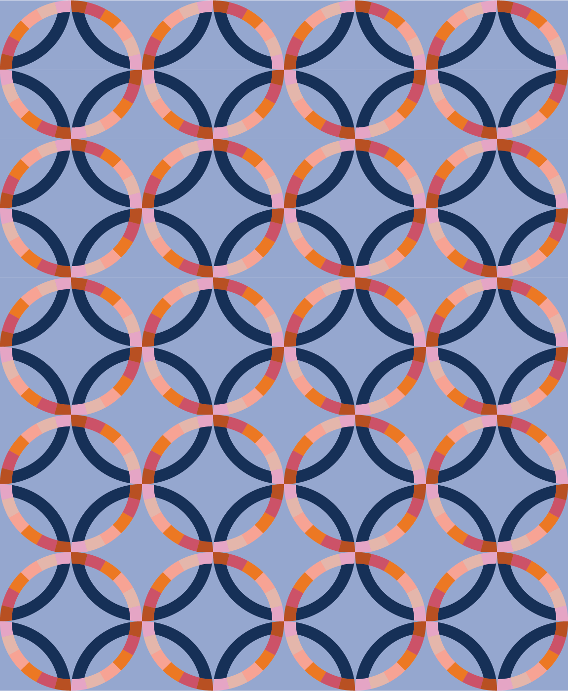
In this version, the background fabric is a lighter value than Template 2 units. This helps the “background circle” maintain a strong circular shape. The FPP pieces are organized in an ombre pattern, which draws your eye around the quilt top in a sinuous manner.
In this version, the darkest fabrics are used in the center of the FPP template. This highlights the “corners” of the foreground circle and minimizes the visual movement around the quilt top.
Here, the background fabric is darker than the Template 2 units. The FPP units also have a variety of dark and light values of warm and cool colors. This juxtaposition introduces a lot of movement, and the circles almost look as if they are leaning to the right. Squint your eyes and there is a strong diagonal energy in this quilt top.
In this version, there is less directional energy and movement across the quilt top. The “background circle” maintains its shape because it contrasts nicely with the background fabric. And the foreground FPP circles are made with mostly medium value fabrics, but with a confetti-like sprinkling of color across the rings. Some of the lightest values are at the ends of the FPP Template, which visually glues each circle together.
I hope these mockups help you visualize what kind of movement and energy you’d like to bring to your Fluttersome FPP block! Make sure you share your projects and progress on Instagram using #fluttersomequiltblock and #mijapatterns.


