
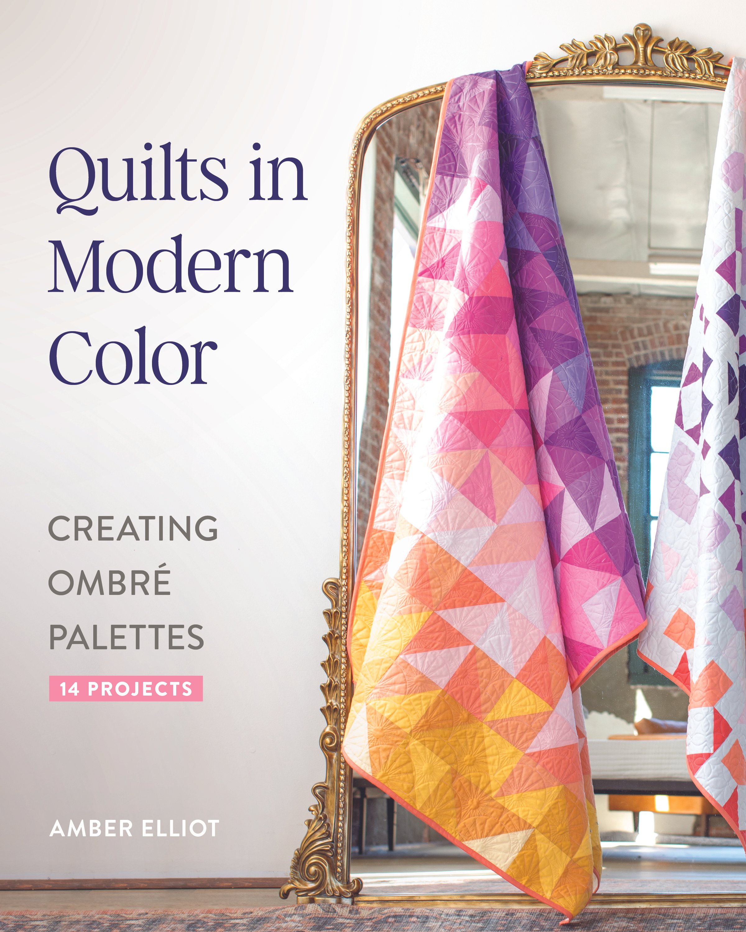
Book Review: Quilts in Modern Color
When my friend Amber of Alderwood Studio told me she was writing a book to teach quilters how to to create ombré color palettes, I knew I needed to get my hands on a copy. Because, while I love designing quilt patterns, I love writing quilt patterns, I love sewing quilts…I just don’t love picking quilt fabrics. Creating cover quilts and quilt kit options is such a daunting task. There are a few quilts I’ve made where I really regret my fabric choices. This is in part because if someone asked me to talk about the fabrics I picked… all I could say is “I don’t know…I picked based on vibes.”
Don’t get me wrong. I think picking quilt fabrics based on vibes is a fine place to end up. I just don’t think it’s a strong way to start building a color palette. Enter Quilts in Modern Color. Amber walks you through creating gorgeous color combinations based on gradient and ombré color harmonies. Plus, she includes a ton of different gradient layouts and color inspiration. To that end, I thought you might like to see some color palettes I built using the information from Amber’s book. Keep scrolling to learn more about the book and to see a preview of a quilt pattern I’m working on!
What immediately jumped out at me was how Amber differentiates between gradients and ombré color palettes. The way she describes these differences is the first time this information has really clicked in my brain. The book includes two sections that I’ve got earmarked for constant reference.
Building a gradient around value
Building a gradient around hue
And if the words value and hue don’t mean much to you, don’t worry. There’s a whole section on color theory basics and describing colors. If you want to jump right into making ombré quilts, Quilt in Modern Color has 14 projects with suggested color palettes all ready to go for you. But you want to spend some time building your own color palettes and exploring color harmonies, there is plenty of information in the book to jumpstart your creativity.
The Knitmare quilt is a pattern I cooked up based on my 2025 BOM, the Broom Cupboard quilt. I haven’t started sewing anything yet, so no promises on a release date. I still need to pick cover fabrics. But that’s why Amber’s book is so timely for me! Below, I’ve shared a couple color palettes I built using the tools in Amber’s book.

In the above color palette, I wanted to emphasize a true Halloween color palette. I started with complementary purples and yellows, but realized I was gravitating towards red-purples, which meant I could introduce yellow-greens. I’m a sucker for warm colors, so I’m not surprised I learn towards red purples instead of blue purples.

In this color palette, I went for a triadic color harmony. Amber notes in her book that triadic harmonies can be hard to pull off in a gradient palette. And after this exercise, I definitely agree with her. I wanted a candy inspired color palette, so I started with very saturated pink, yellow and blue hues. I found that grading the yellows to meet both the pink and blue was pretty tough. I don’t think this is a very successful Halloween-themed color palette, but regardless, the colors turned out pretty cute.
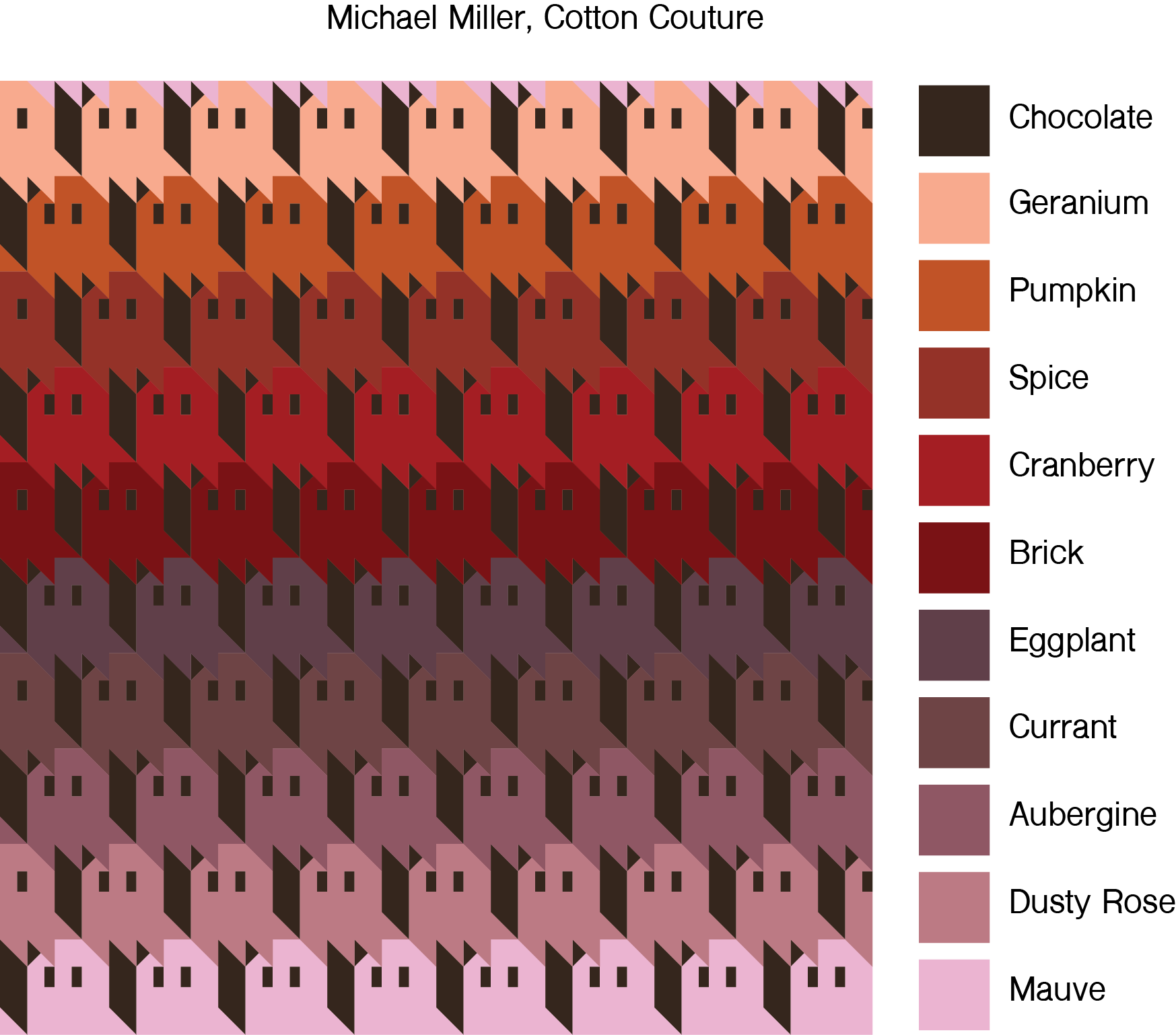
This is an attempt at an analogous, Fall-themed color palette. I think the transition between Brick and Eggplant could use some refining to be a true gradient. I don’t typically work with red, so I tried to move out of that hue as quickly as possible. I also think the Mauve is a little too icy for this palette.

Finally, I tried my hand at monochrome color palette. The color palette is moderately successful. I think the transition between Brown and Cinnamon could use some smoothing out, and I’d want to take a black and white picture of the Toffee, Amber, and Ochre combination to see if they are too close in value. However, I don’t think the brown monochrome colors work in this quilt design. A bunch of brown ghosts don’t really make the pattern sing. And this is where is idea of building palettes based on vibes is useful. While technically, I think this color palette is lovely, brown ghosts just don’t vibe, you know?
If you want to try your hand at building your own ombré color palettes, I highly recommend picking up Quilts in Modern Color. It’s full of incredibly informative diagrams, projects and pre-built color palettes. I’ve been referencing it non stop as I plan my next couple patterns.
Make sure you check in with other folks sharing their book reviews!
Monday, March 31st:
Suzy Quilts: https://suzyquilts.com/, IG: @suzyquilts
Tuesday, April 1st:
The Crafty Quilter: https://thecraftyquilter.com/ IG: @thecraftyquilter
Wednesday, April 2nd:
Sewspicious: https://www.sewspicious.com/, IG: @sewspicious
Thursday, April 3rd:
The Weekend Quilter: https://the-weekendquilter.com/ IG: @the.weekendquilter
Friday, April 4th:
Broadcloth Studio: https://www.broadclothstudio.com/, IG: @broadclothstudio
Saturday, April 5th:
Riley Blake Designs: https://www.rbdblog.com/, IG: @rileyblakedesigns
Sunday, April 6th:
Toad and Sew: https://www.toadandsew.com/, IG: @toadandsew
Monday, April 7th:
Mija Handmade: https://mijahandmade.com/, IG: @mija.handmade
Tuesday, April 8th:
XOXSEW: https://www.xoxsew.com/, IG: @xoxsew
Wednesday, April 9th:
Diary of a Quilter: www.diaryofaquilter.com, IG: @diaryofaquilter
Thursday, April 10th:
Urban Dwell Studio: https://www.urbandwellstudio.com/, IG: @urbandwellstudio