
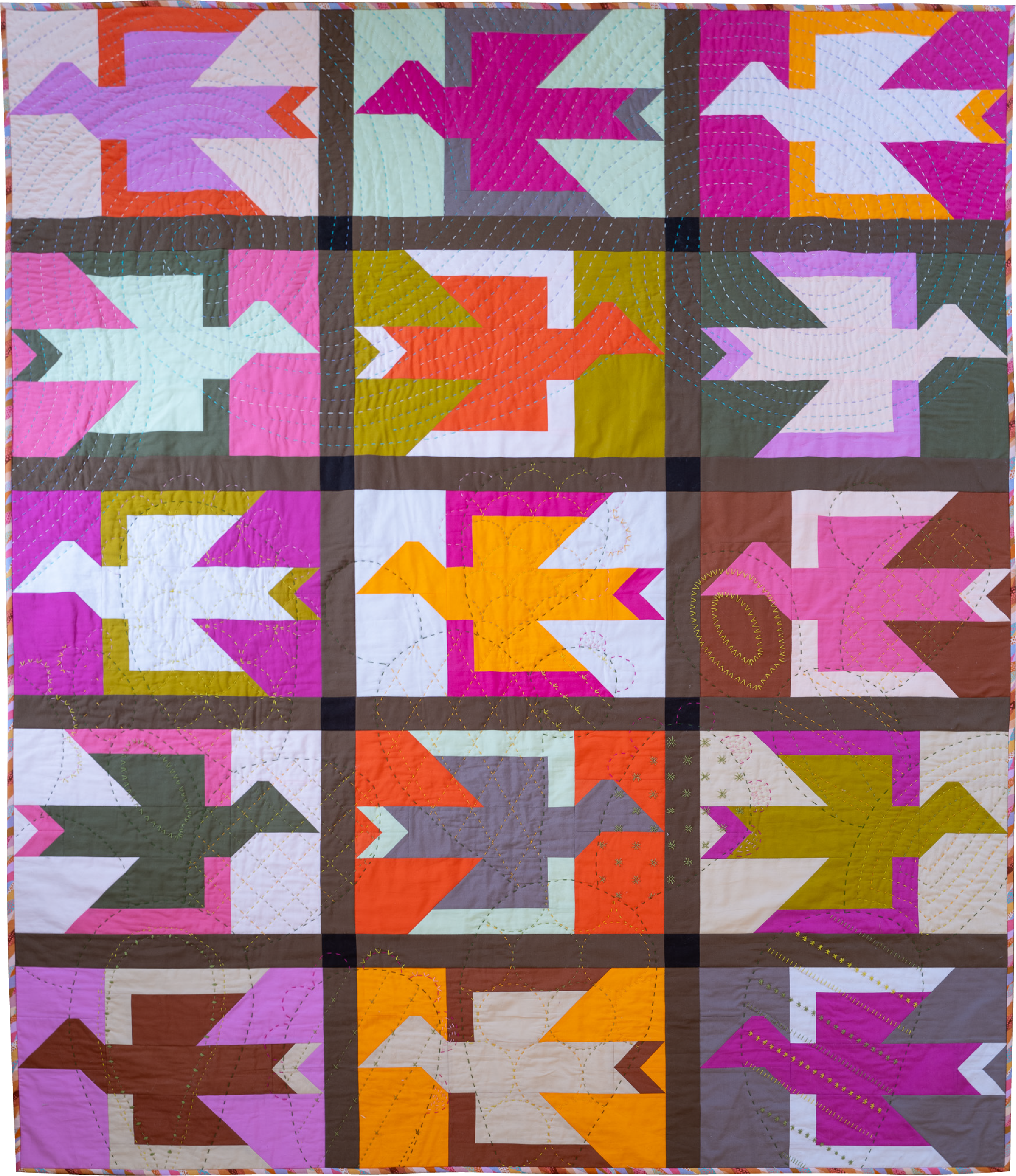
Several people in my life have recently become avid birders. I don’t know that it’s my next hobby, but I can appreciate their enthusiasm! Since my loved ones are always thinking about birds, which birds are in town, what birds are going where… that got me thinking: if I could take flight and spend a season anywhere in the world, where would I go?
That question inspired five fabric pulls for my Alight quilt pattern, each one inspired by a dream vacation destination. From peaceful lakeside retreats to sun-soaked desert escapes, I wanted to explore how a change in color palette could give the same quilt pattern an entirely different personality.
Whether you're drawn to cool, nature-inspired hues, cozy cabin colors, or a playful retro palette, I hope these destination-inspired color ways spark some ideas for your next quilt! Pack your imaginary suitcase, and let's take a look at five places that inspired these fabric combinations.
Color Ways to Inspire Your Next Bird Quilt
Before we get too far in, make sure you’re familiar with the three different ways to organize color in the Alight quilt:
Monochromatic Mania
Value Play
Color Chaos
The value play and color chaos don’t appear very different at first glance - that’s why I’ve got a whole blog post that outlines these three approaches for you to check out. The main difference is how much you plan your blocks before hand. Color chaos is a great approach for quilters who like to pick and use fabrics on instinct…not a lot of planning, just vibes.
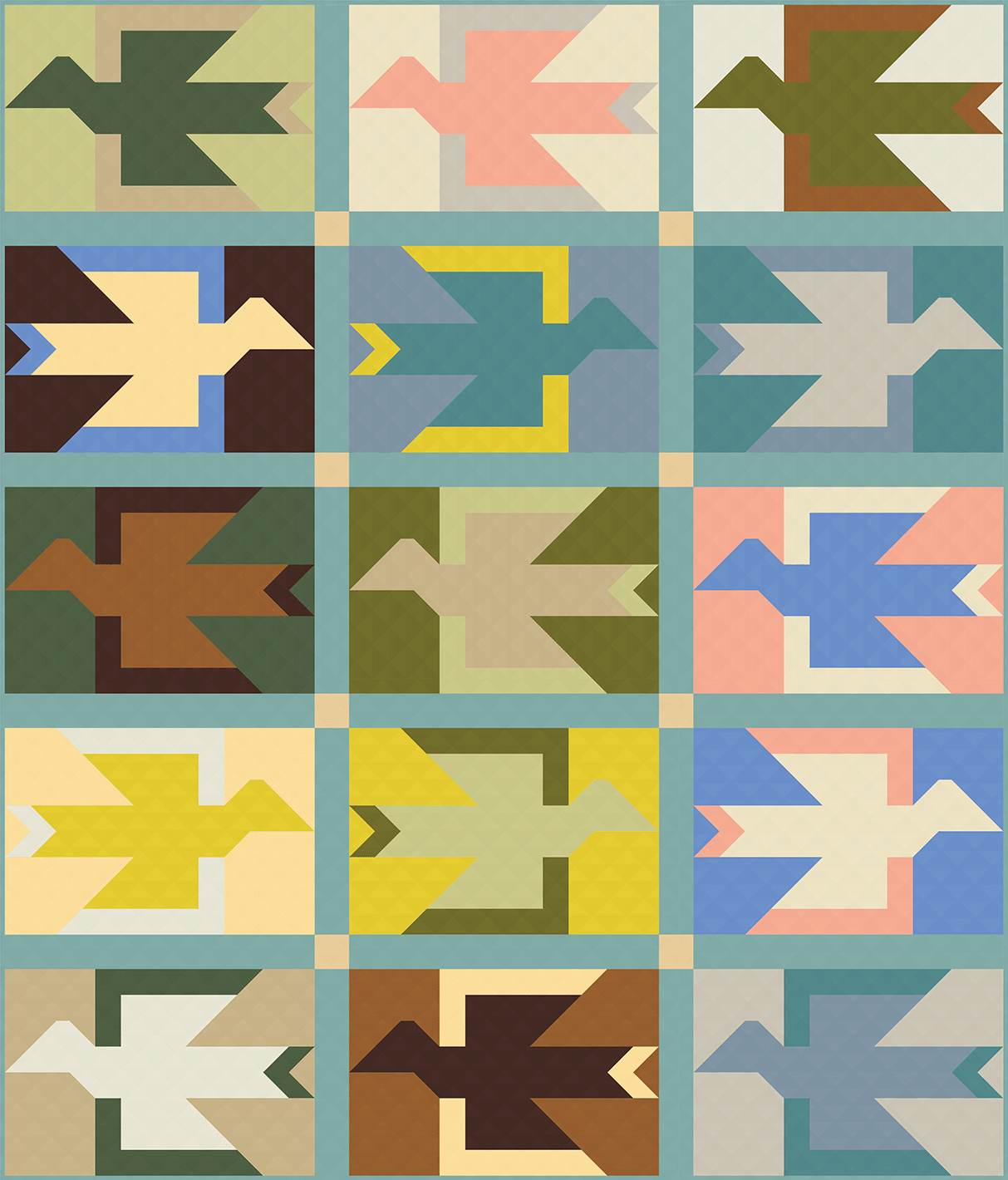
1) Lakehouse
We’re starting off strong with a color chaos approach. I have to admit, I’ve not spent a lot of time on a lake, but I wouldn’t say no to a week long vacation on Lake Tahoe. When I was pulling these fabrics together, I couldn’t resist the playful balance of earth tones here. Plenty of water and green colors, with a joyful pop of peach and yellows.
Fabrics are Moda Bella Solids: Fig Tree Olive, Fig Tree Cream, Porcelain, Brown, Celery, Citrine, Etchings Stone, Together Tan, Peach, Pond, Kansas Green, Hay, Platinum, blue, and Soft Yellow. The sashing is Dusty Jade and the cornerstones are Parchment
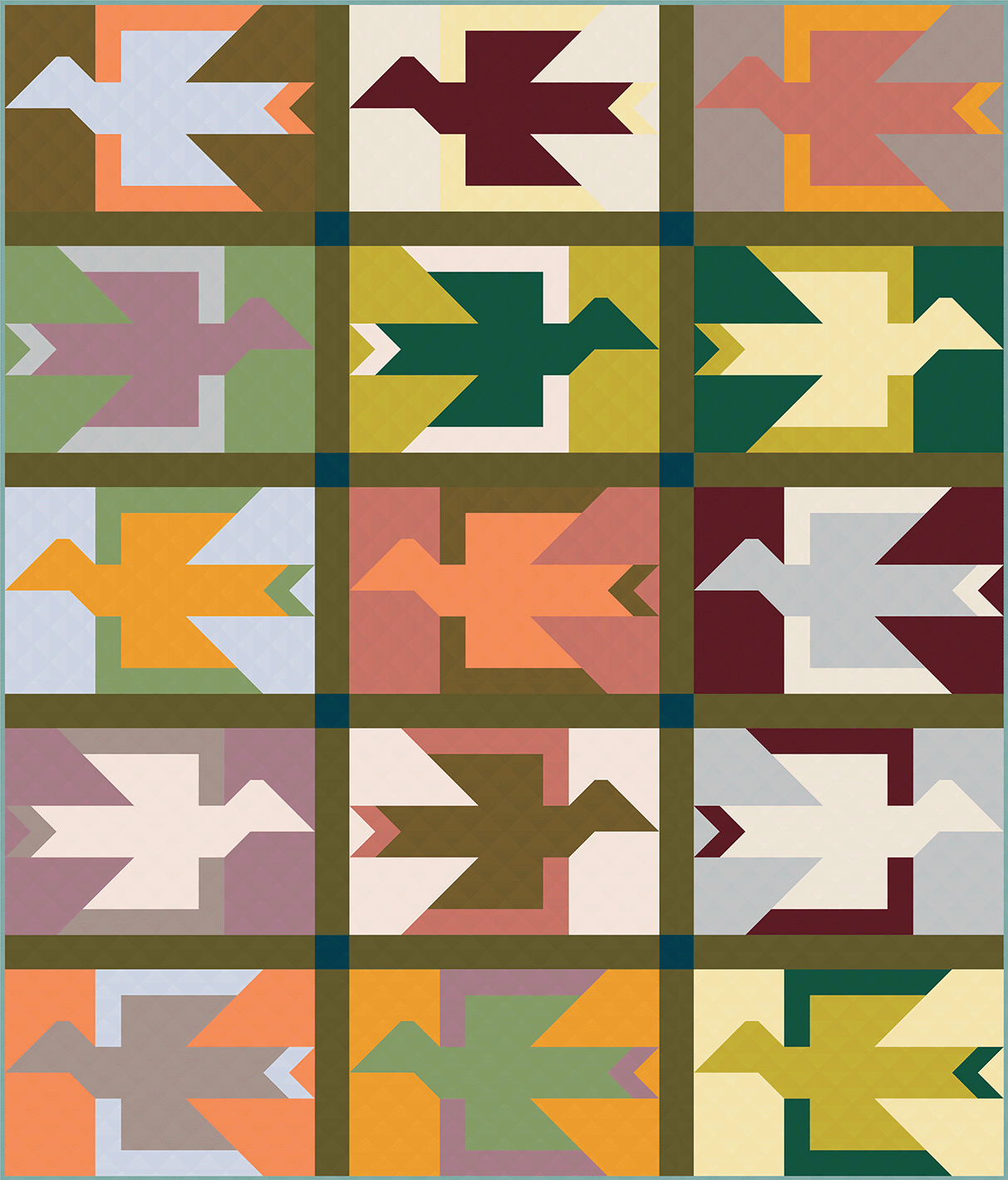
2) Paradise Palms
I dream of living in a mid century modern home. Until then, I can just scroll through Zillow listings in Paradise Palms. I stayed away from the typical light and bright blues associated with mid-mod decor, and introduced a wine and a soft purple. I thought this could complement the oranges and olive greens typically found in MCM palettes. This version shows off color chaos approach of the Alight quilt.
Fabrics are Art Gallery Fabrics PURE Solids: Potters Clay, Miami Sunset, Summer Sun, Asparagus, Ethereal Pink, Vaporous, Peacock, Olive Oil, Sweet Fig, Coconut Milk, Buttermilk, Candied Cherry, Golden Bronze, Marmalade, and Periwinkle. The sashing is Garden Fern and the cornerstones are Lake Front.
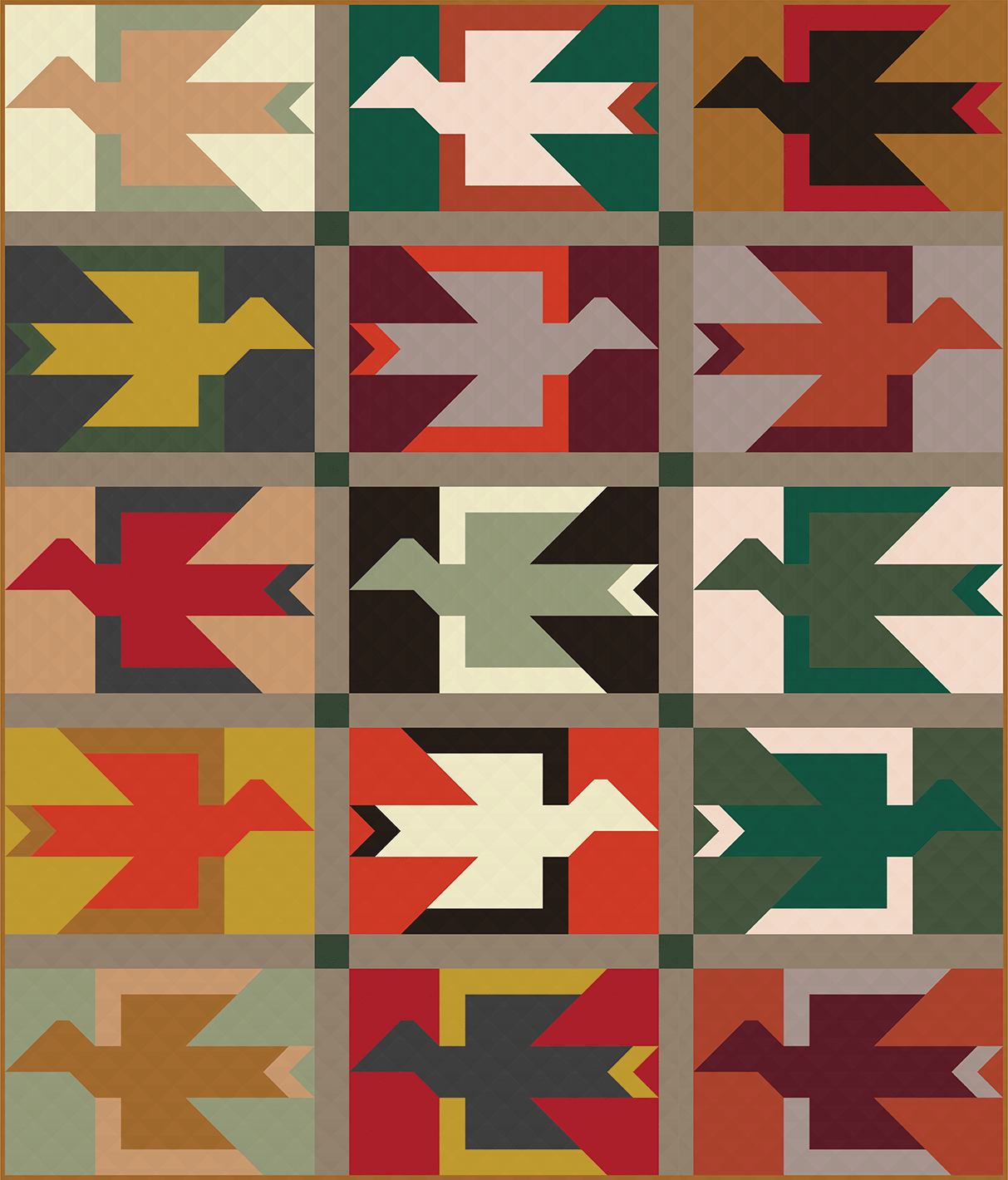
3) Highlands Lodge
Can you tell I really love color chaos? This is the last version with this approach, I promise. Catch me in the right mood and I’ll tell you that I love tartan, wool textiles and rainy days. When I’m in those kind of moods, I want to be snuggled under a quilt like this in a great room filled with generations-old tapestries, photo albums of royalty and a roaring fire. I imagine the lodge is full of brass yellows, warm greens and rich browns. I added in a few orangey-reds, just enough pop to make it interesting.
Fabrics are Art Gallery Solids PURE Solids: Peacock, Raw Gold, Peach Sherbert, London Red, Chamomile, Potters Clay, Candied Cherry, Sweet Macadamia, Eucalyptus, Fresh Sage, Ruby, Coffee Bean, Lemon Tart, Toasty Walnut, Magnetism, and Aurora Red. The sashing is Mink and the cornerstones are Hunter Fields.
4) Sedona
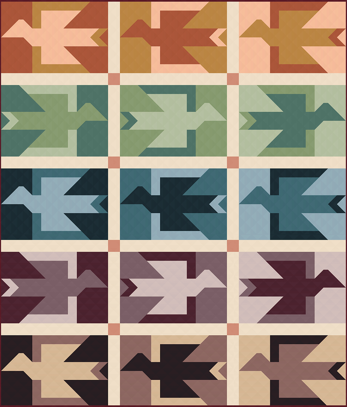
With its rust rocks, bright sun lit skies and rich foliage, I would fall in love with the dusty colors of Sedona. Hours-long hikes surrounded by majestic geography is my idea of a good time. Which makes this the most realistic vacation spot for me! This version uses the monochromatic mania color approach. By keeping the color families together, the quilt top feels calm and soothing.
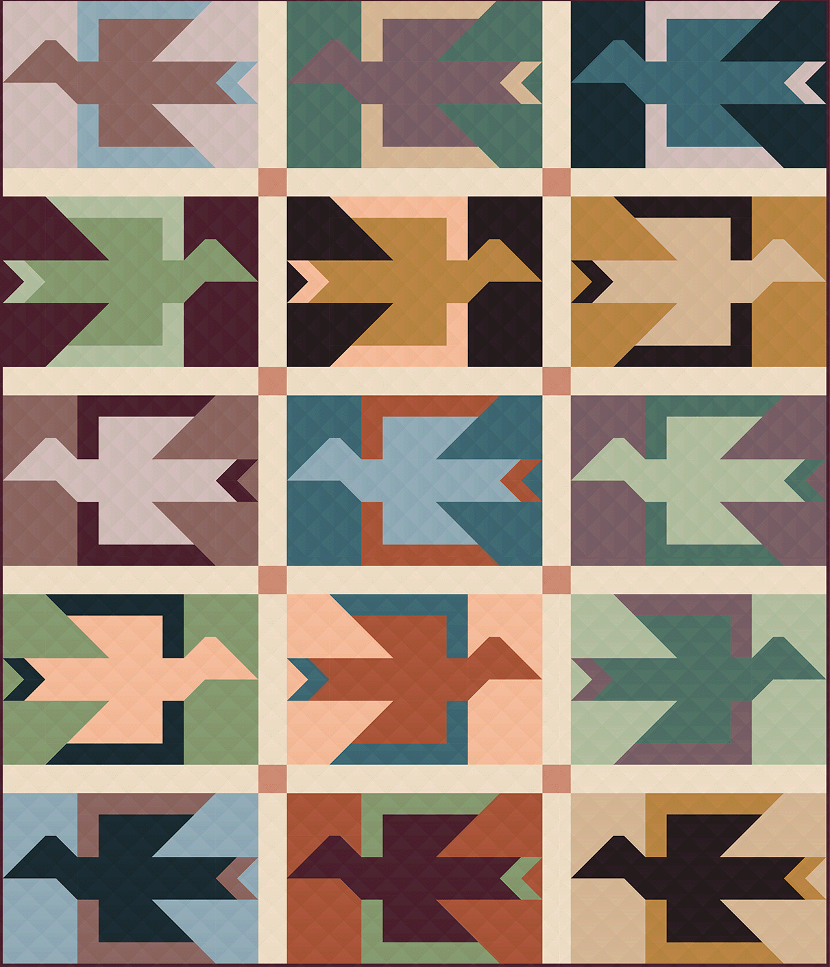
Let’s check out what this same color palette looks like with the same exact fabrics, but a different color approach. This version mixes up the color families, but still uses the light-medium-dark value play to keep structure in the design. This introduces much more movement to the quilt top. The colors still feel cohesive, but the calm and orderly feelings from the first version give way to lots of smaller color conversations in this version.
Fabrics are Suzy Quilts Signature Solids for Art Gallery Fabrics: Poppy, Queen Bee, Shrimpy, Hemlock, Matcha, Pistachio, Nova, Honeymoon, Cerulean, Velvet, Haze, Monet, Truffle, Thistle, and Ginger. The sashing is Pearl and the cornerstones are Snap Dragon.
5) Joshua Tree
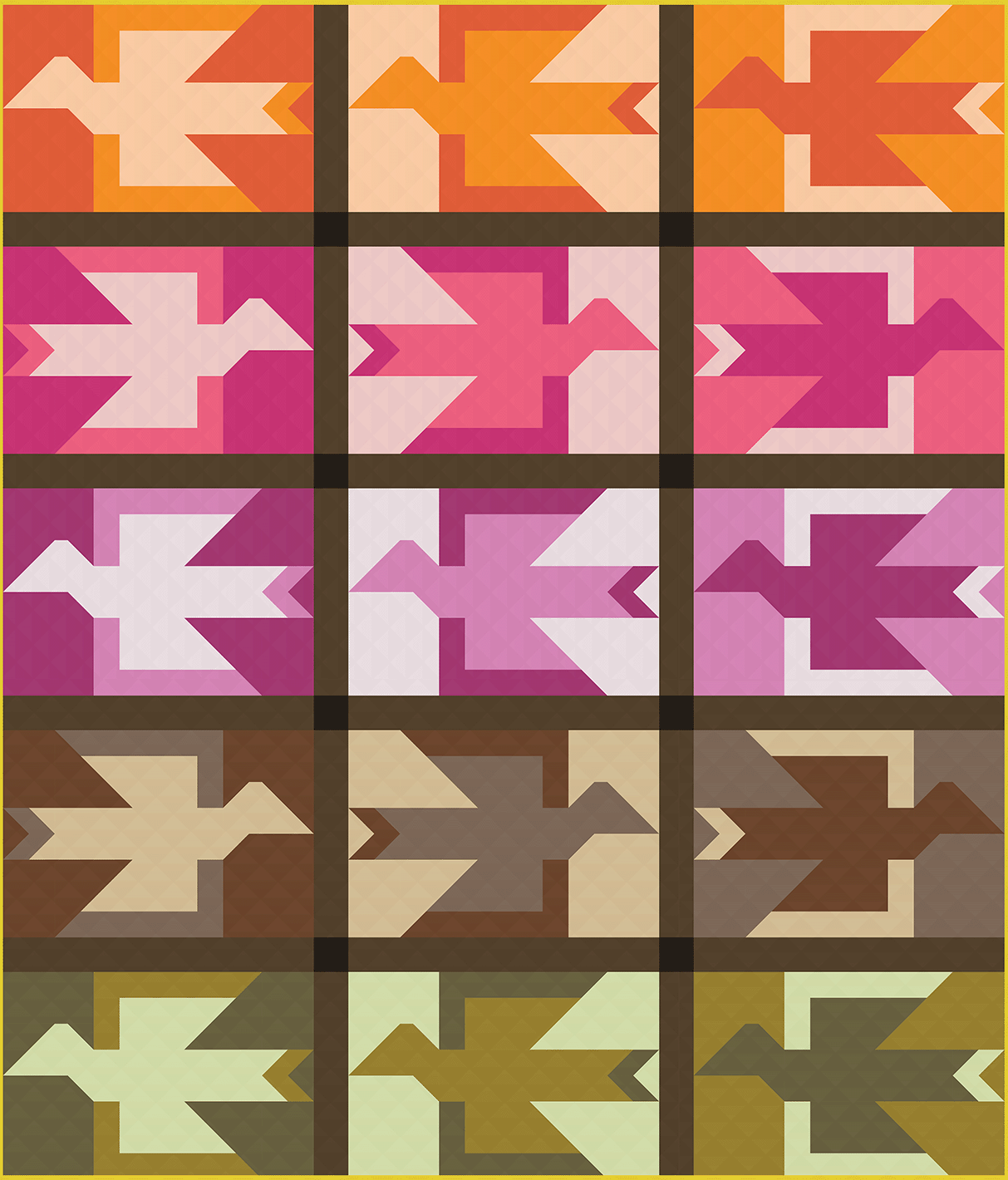
I’ve driven through Joshua Tree, but I’d go back for a long weekend in a heartbeat! This California desert inspired version uses the same fabrics as the cover quilt, but instead of mixing up the fabrics across the blocks, the fabrics stay in their color families. The sun bleached light-values, earthy dark values and dramatic accent colors perfectly celebrate the balance of arid environment and vibrant plant life throughout Joshua Tree.
Each of these mockups is a reminder that there isn't one perfect way to choose fabrics for a quilt. The same pattern can feel calm and coordinated, bright and playful, or wonderfully eclectic, depending on the fabrics you choose and the manner you use them.Are you ready to plan your Alight quilt? Grab the pattern and take flight to your dream vacation home!